Introduction
Spare Parts 3D, a French startup, contracted me to redesign their customer dashboard. Their product, DigiPART, intakes manufacturing parts inventory, analyses the ERP data, and identifies ideal candidates for 3D printing. This product provides added value in obsolescence, lead time reduction, minimum order quantity, inventory reduction levels, and carbon emissions from the OEM supply chain. Their primary customers are large manufacturing and logistics companies.
Problem:
They have built a product for over 7 years without any design or product management input. This (more or less) rendered the product unusable as a SaaS platform - in particular because they central Dashboard "the Adoption Matrix" does not provide any intuitive way for users to know which parts to focus on, or how to move those parts to the next phase within the project towards selecting the parts for 3D printing. Furthermore, users struggled with interpreting how the results were calculated, and what they mean.
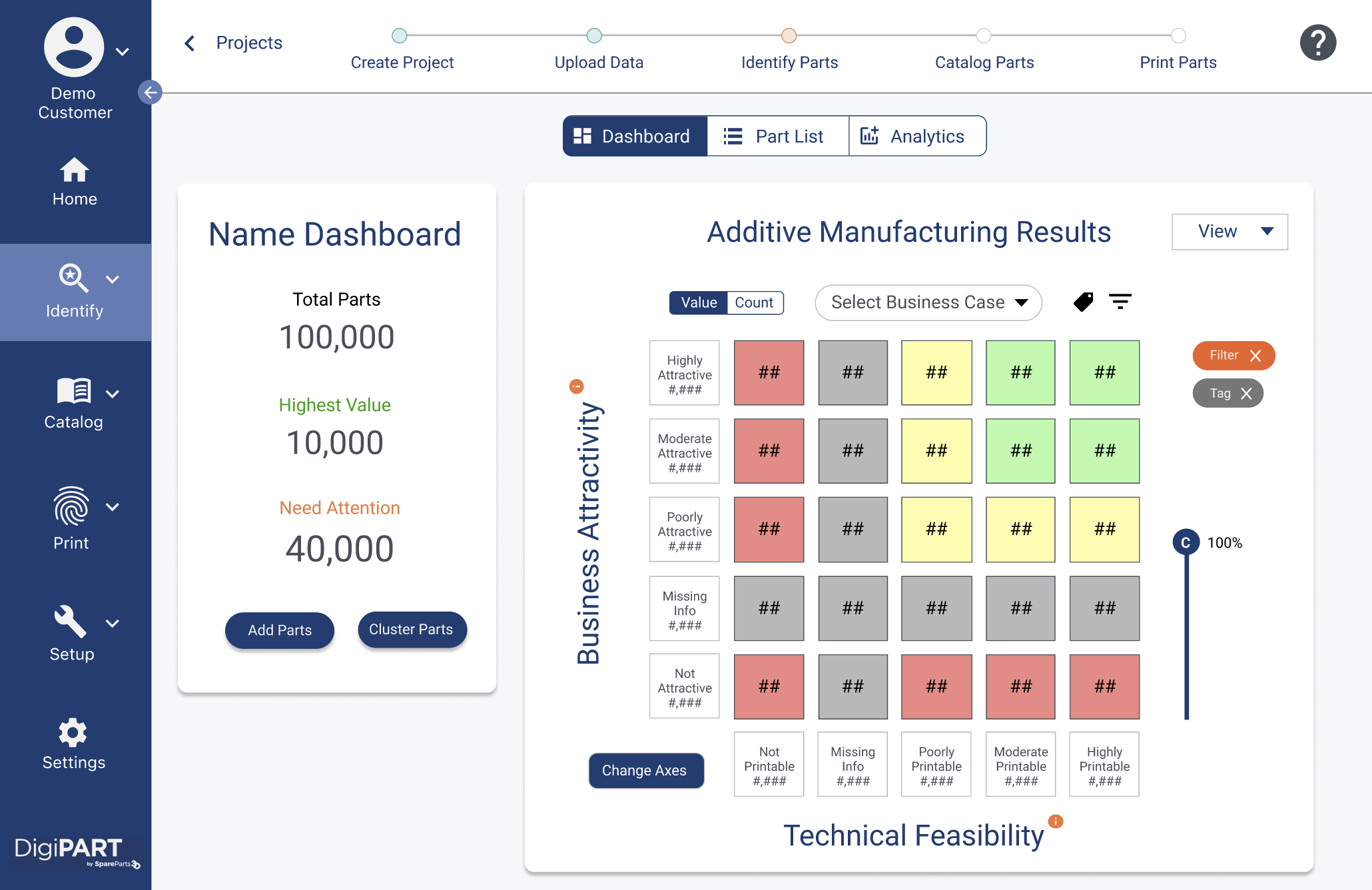
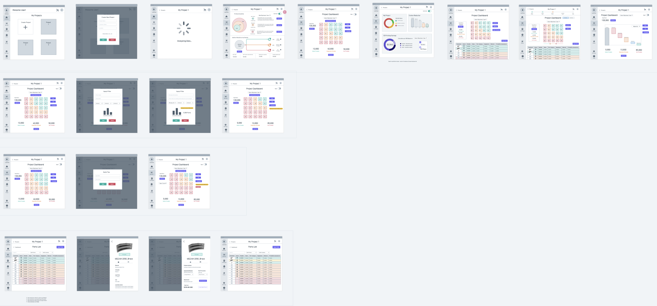
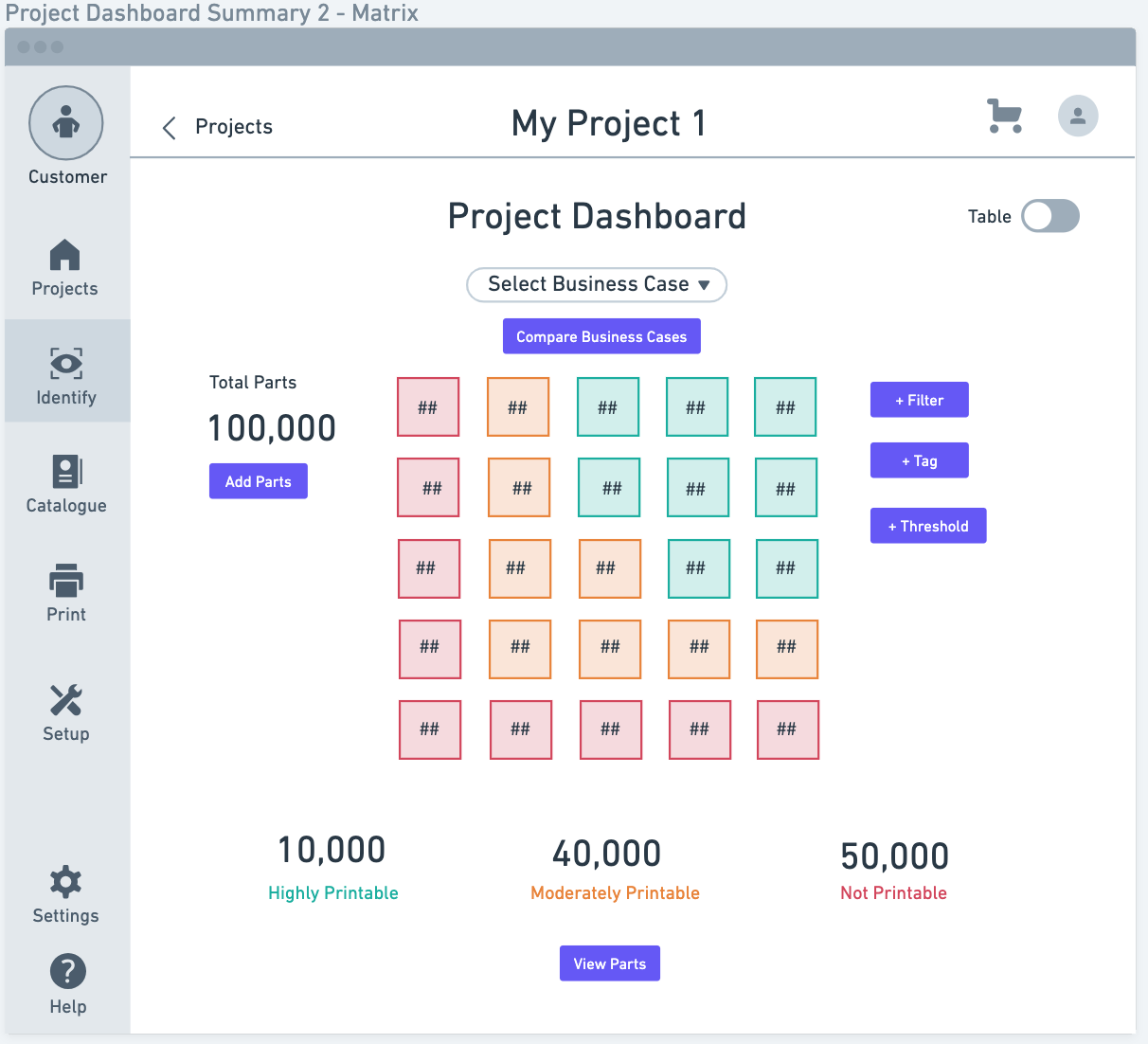
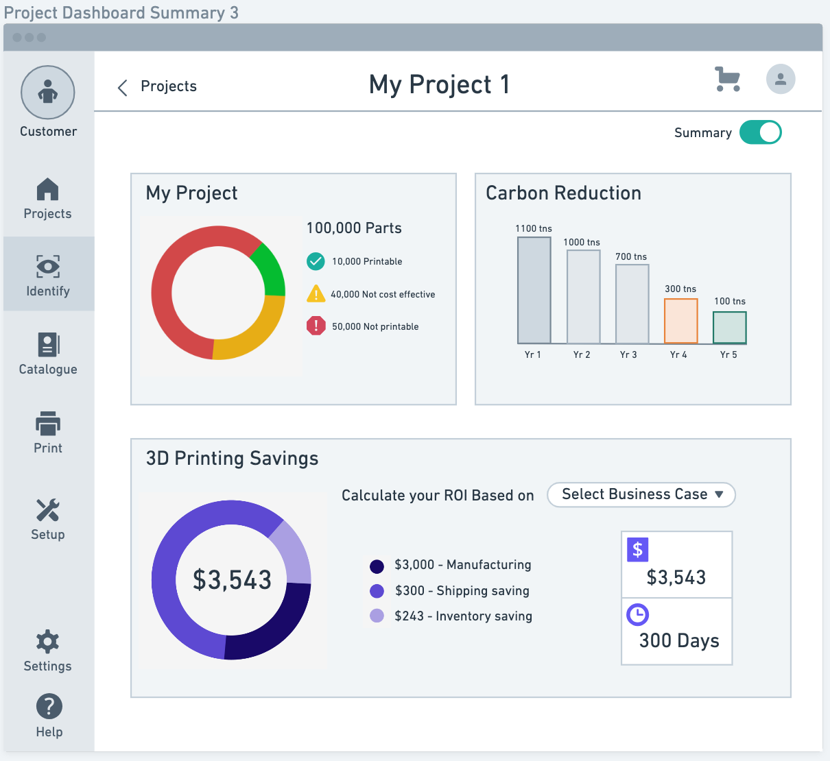
Snapshot of Final Product:
I will explain in detail the design process I followed as well as the tools I decided to use, but here is a snapshot of the final product:
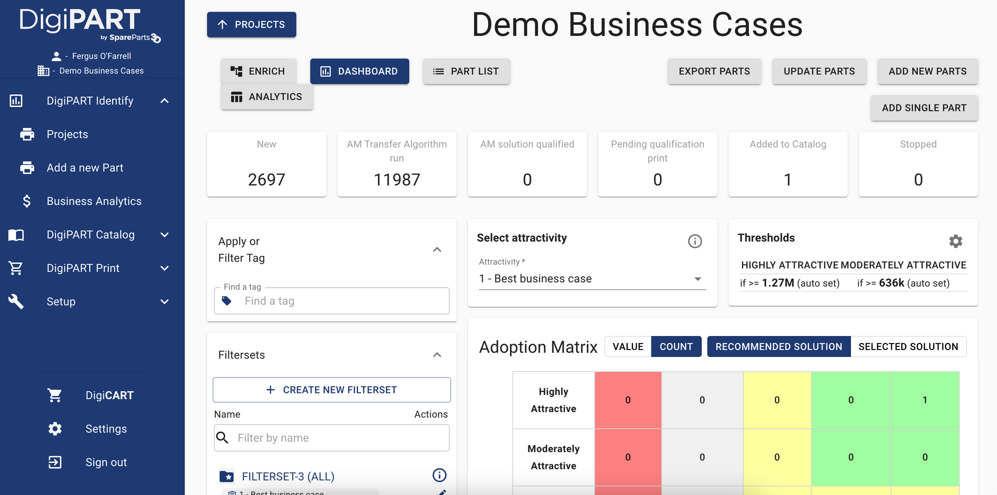
And here's the previous dashboard:
The Design Process
As usual, I started with trying to understand the problem deeper and as mentioned this was a bit more complex than other products I've worked on, since they have been building DigiPART for 7 years without any UX or Product Management input.
Step 1: Research & Empathize
I decided to begin with some research tools to understand the problem they were facing. The first few people I chatted with warned that many people had varying opinions on the dashboard and what it should/shouldn't do. I decided to use UX tools that converge on a broad range of topics that can then be used to diverge back towards a solution. This way many people's opinions can be heard and incorporated into the solution.
In summary, I used the following tools:
- 5 internal research interviews
- Affinity Mapping
- Sitemap/Information Architecture (of current product)
- User flows
- Competitive Heuristics
- How Might We...
- Low-fidelity wireframes
- Validation (user testing)
- High-Fidelity prototype
- Validation (user testing)
- Hi-Fi prototype iteration
Research Interviews
I needed to start meeting folks who understand the complex problem this product solves. Before selecting 5 people to interview at the company, I put together a research plan to answer the following 3 (primary) questions:
- How do users interact with the interface today?
- What elements do they focus on and what do they care about?
- What are their main pain points with the Dashboard?
I then used Mural to summarize each interview. Here are the unsorted findings from the 5 interviews:
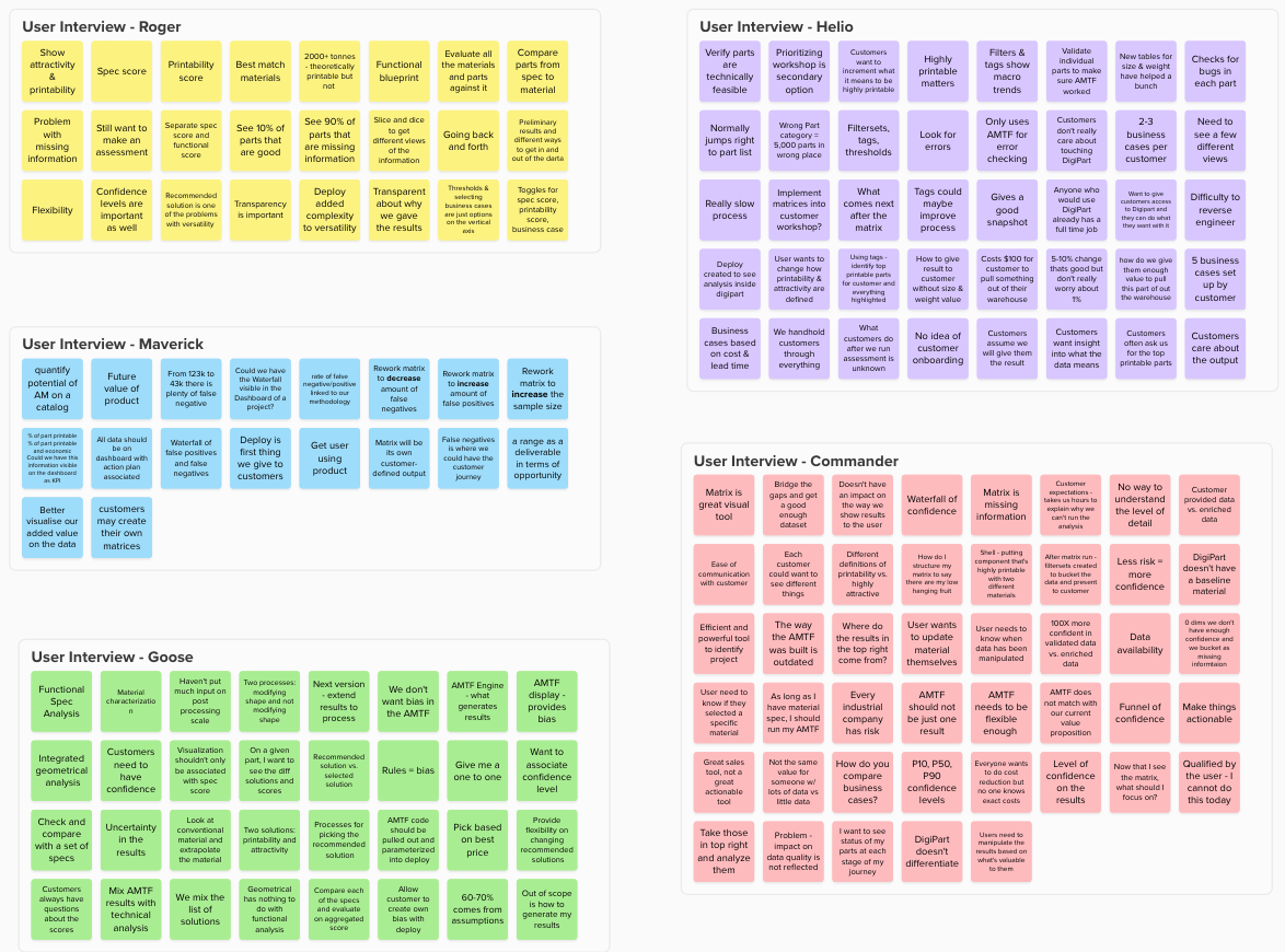
Affinity Map & Theme Identification
I decided to use Affinity mapping to synthesize the research and identify buckets of themes to begin thinking about what a solution might need to cover. I find affinity mapping particularly useful when there are a wide-variety of opinions on what a product should/shouldn't do since it puts everyone's opionion into a bucket or theme. Here's a visual:
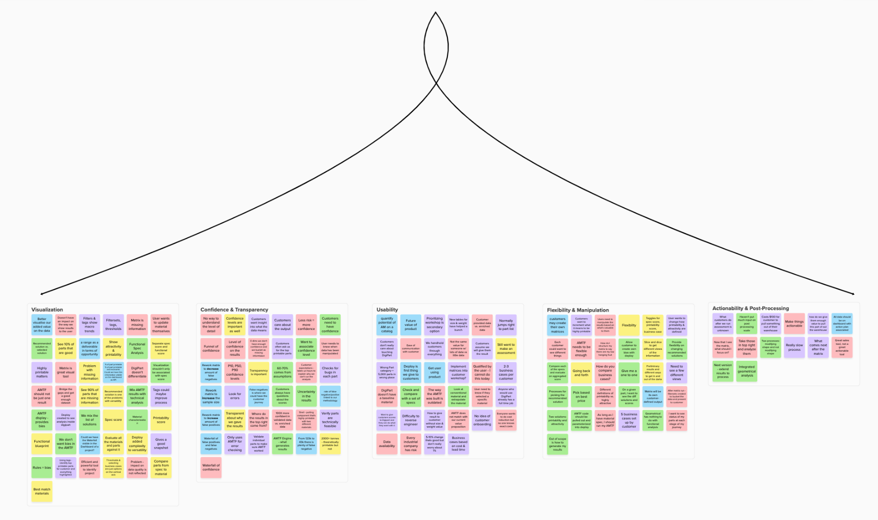
It was clear from the synthesis that users struggled with 5 core themes in their current design of the Dashboard:
- Visualization of the results
- Confidence & Transparency of the results
- Usability
- Flexibility & Manipulation of the results
- Actionability & Post-processing (i.e. what comes after we have the results?)
Sitemap
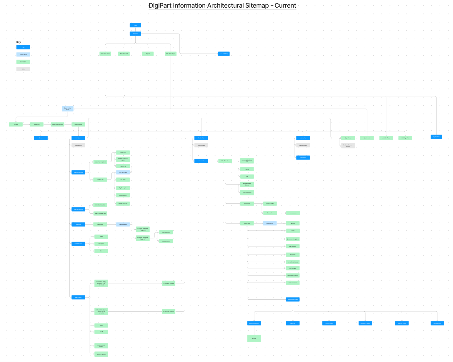
I then looked at the way users are presented information by diving into the product's current sitemap. I decided to build a site map since 4 of the core themes (visualization, usability, flexibility, and transparency) revolved around the way information is presented to an end-user.
After looking at what I put together, it was very clear that the existing product is difficult to navigate and doesn't really empower users to find and use the functionality that's important to them:
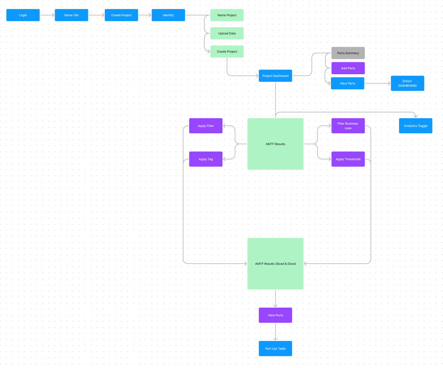
Proposed "Simpler" Sitemap
I then tried to simplify the user flows into something more digestible - focusing on the core themes to allow users to easily visualize the information, understand the results, gain transparency into the results, and use the tools that they need:
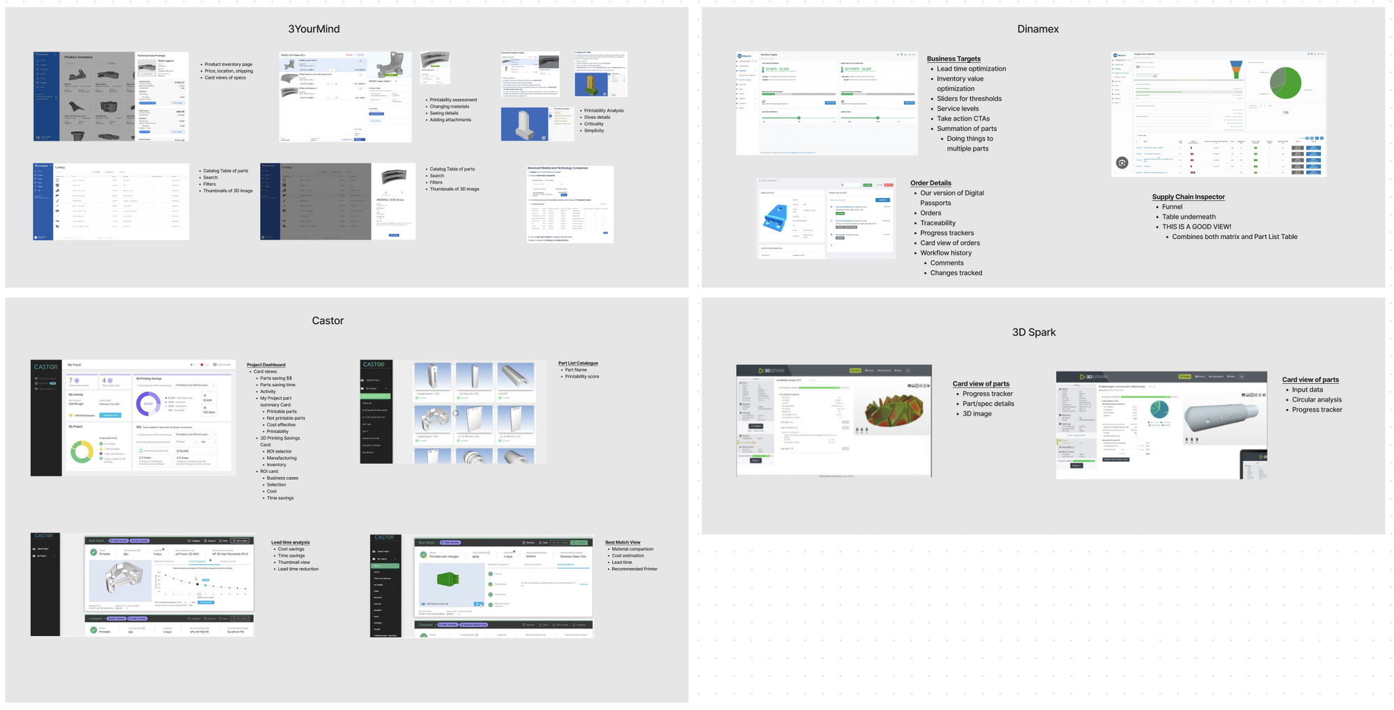
Competitive Heuristics
It's always a good idea to look at how competitors solve similar design challenges when trying to find a solution to a problem. I got a list of 4 competitors from the CEO and put together a brief report of competitor dashboards to gain some design inspiration.
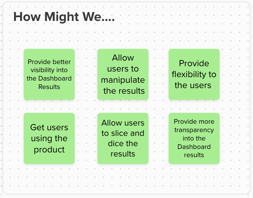
How Might We...
Before jumping into designing a solution, I reflected on the themes from the affinity map, competitive heuristics, and their current information architecture to start coming up with some areas to start solving:
Step 2: Design & Validate
I did a bit of sketching for inspiration as usual, but for designing in low-fidelity I used a really great tool called Whimsical where you can create wireframes rapidly. I focused on 3 core user flows of how users create projects, land on their dashboard, and then "do stuff" (i.e. manipulate) to the results.
I also offered 5 different versions of the Dashboard results so that I could see reactions through testing.
I then tested with 5 internal users to validate my hypothesis. The core script started with:
- What do you expect from the dashboard?
- What is the most important information that you would see and do?
- Describe what you see on each interface
- What are the typical workflows that we need to check?
And then I focused on the scenarios/flows below
- Create a project
- What do you see on the project dashboards? (5 different options)
- You want to find all data that has missing information in the dashboard - how would you do that?
- Scenario: You want to see the details of the printing assessment on a specific part and what material DigiPart selected for you - how would you do that?
- How would you change the printing material on a specific part?
- How would you see the change reflected in the dashboard?
- How would you check if a specific part is printable?
- How would you see details about the part?
Based on the feedback, there were a few clear winners from the dashboard:
Step 3: Prototype & Test
I then moved into high-fidelity wireframes, and also did a round of 5 user interviews for testing. I tested similar user flows:
- Create a new project and describe what you see on the dashboard
- How would you gain more transparency into the way the results are calculated?
- How would you add new parts to your project?
- How would you add a filter or tag to find all parts with missing information?
After synthesizing the results, and iterating on a few areas that were key - notable:
- Users wanted a summary of their parts. Solution: added a summary card
- Users wanted a way to see how "Business Attractivity" and "Technical Feasibility" are calculated. Solution: added modal explanations
- Users wanted to know where they were in the process of the "Digital Inventory Journey" - I solved this in two ways:
- Fixing the navigation so that it highlights in a lighter shade blue which part of the product you are in.
- Added a journey indicator at the top (similar to a checkout flow) so that users know the next step and the previous steps they've taken.
Below is a recording of the final product:
Summary & Design Learnings
I learned a lot from this process - mainly since it was the first time I was redesigning a SaaS product. previously I had only worked in mobile. Here are some of the takeaways:
- There are a lot of design tools you can use to solve problems - only do what is helpful to you!
- Looking at competitors/other products is key to gaining design inspiration
- After you've gone through the process - make sure to revisit the initial problem, make sure you understand them, and revisit the themes you identified
- There is a big difference between user testing and design reviews (I did not mention above but there was one session that I was hoping to be a user testing session but it turned into all 7 managers critiquing the design in a room... big difference compared to figuring out if a user can complete a task!)