PostUp is a new startup where freelancers and remote workers share tip and advice. They have recently received lots of feedback about how to find good public places to work from and they want to make it easier for remote workers to find those places. I was brought on to run a mock design sprint to test out a possible solution.
I followed the typical design sprint process to map, ideate, prototype and (of course) test:
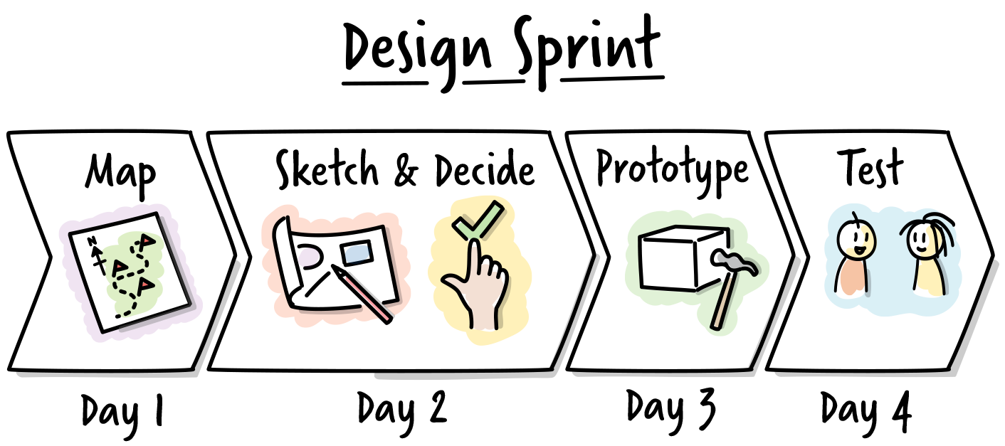
Day 1: Understand & Map
The first day consisted of understanding the different ideas, feedback, and problems that PostUp was seeing.
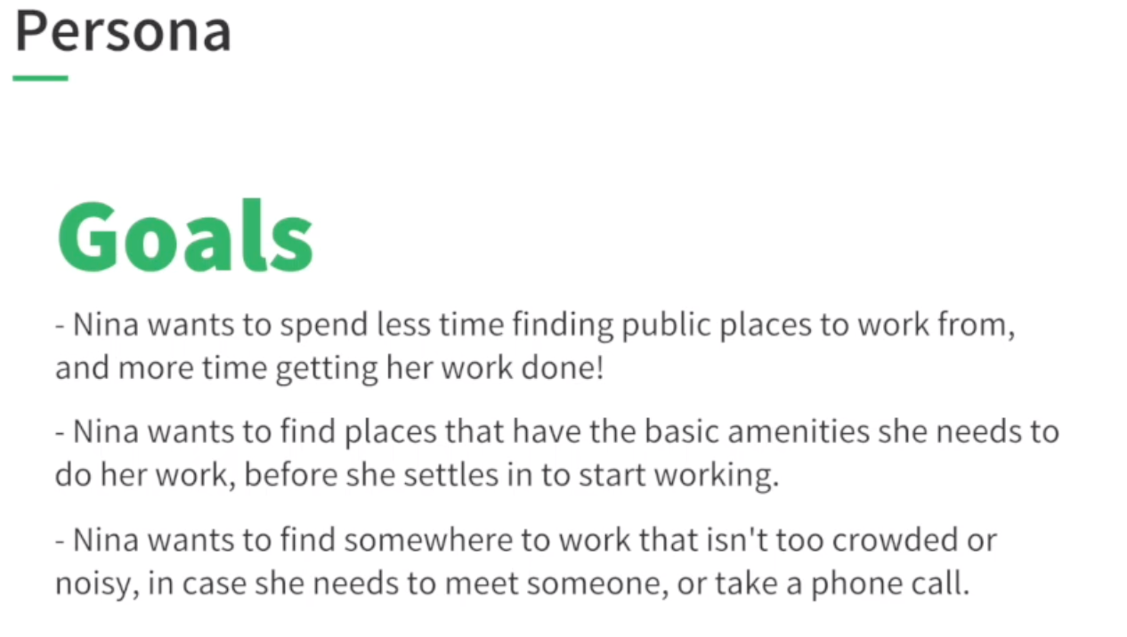
Main goal: provide a directory of the best public places for remote workers to work from.
I interviewed 2 remote workers to understand their needs and personas. My findings:
- Free wifi is good
- Quiet space for calls
- Not crowded
- Wifi and bathrooms
- Wants to know how busy a place is beforehand
- Essentials - bonus for good coffee and food
- Somewhere nearby - location
- Community - people doing same work
- Pictures of the place in the directory is absolutely needed
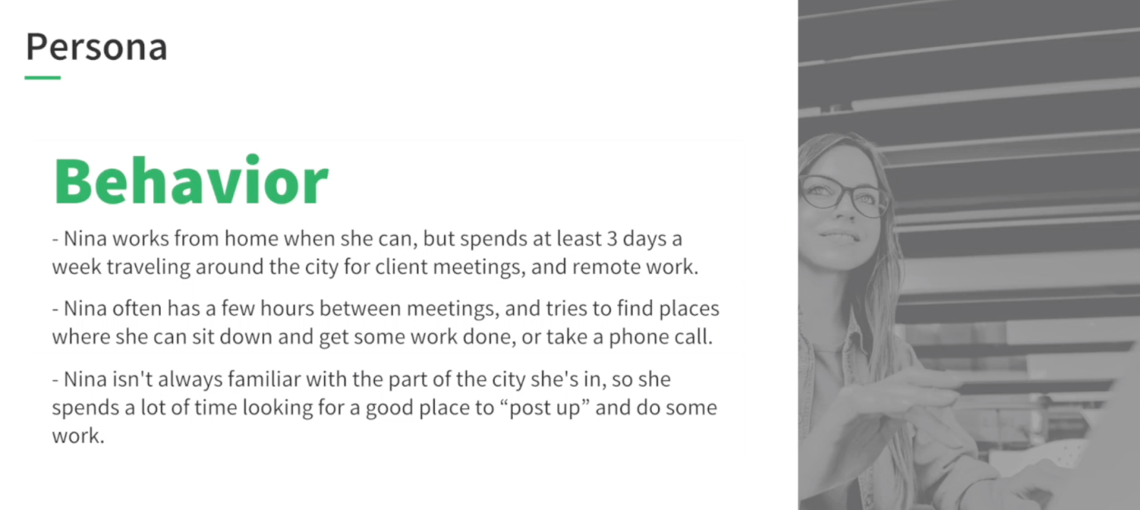
To understand their current workflow, I asked how remote workers currently search for places and found that:
- Libraries but not great cause can’t talk on phone
- Prefers coffee shops
- Distance is important
- Likes Map view
- Looks at photos
- Space
- Needs more than 1-2 photos of the space
- When it’s open - busy time is most important
- What would help you more?
- Crowdedness - are seats/table available
- Food not as important
- Wants to know about wifi, outlets, bathrooms
- Reviews
- Looks at 3-4 places and then decided
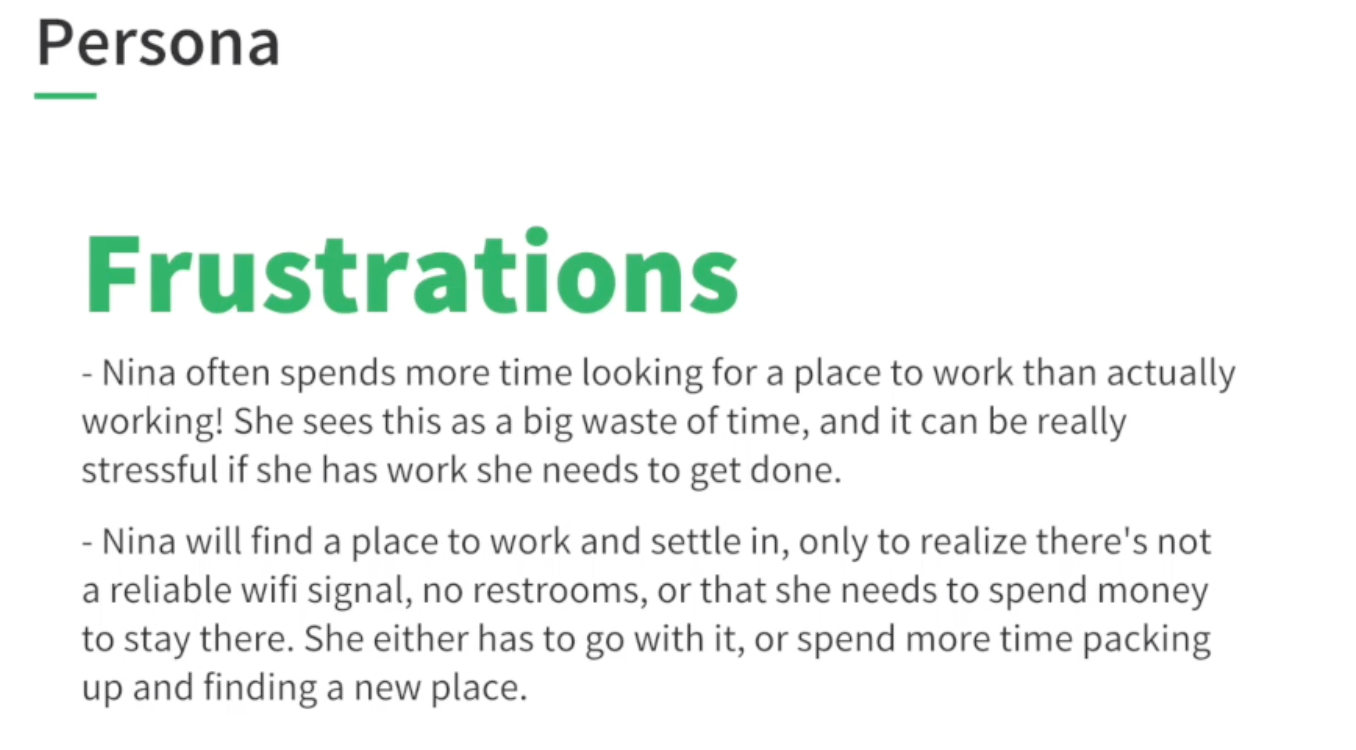
- Most info is time consuming to dig through and doesn’t want to search and make interpret too much
From the research, I came up with the problem statement:
Problem statement:
Remote workers cannot easily find locations to work from easily and generally spend more time searching for places rather than doing actual work. There is a list of primary search criteria that they use but they want a solution for this criteria to be succinct and easy to sift through. Their primary criteria is:
- Location (relative to user)
- Photos
- Amenities:
- Reliable wifi
- Quiet space for calls
- Bathrooms
- Busy times
- Reviews
- Bonuses/nice to haves: good coffee/food and community - people doing similar work
I quickly sketched a map of user journey:
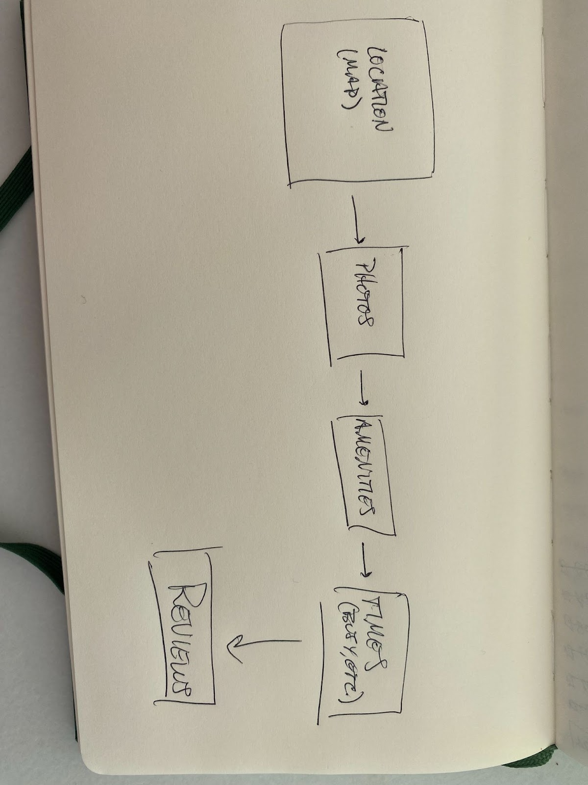
Day 2: Sketch
I spent the next day sketching out possible solutions based on the map above.
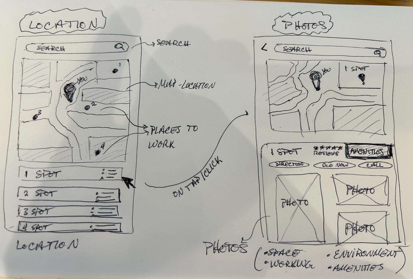
Screen 1 - Location:
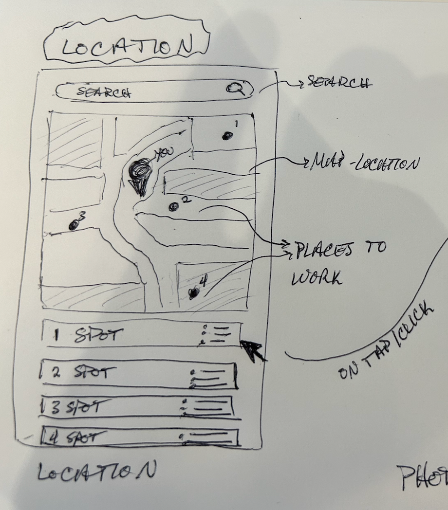
- Map view of location
- Where you are
- Search bar
- Spots around you
- List of spots
- Brief summary
Screen 2 - Photos
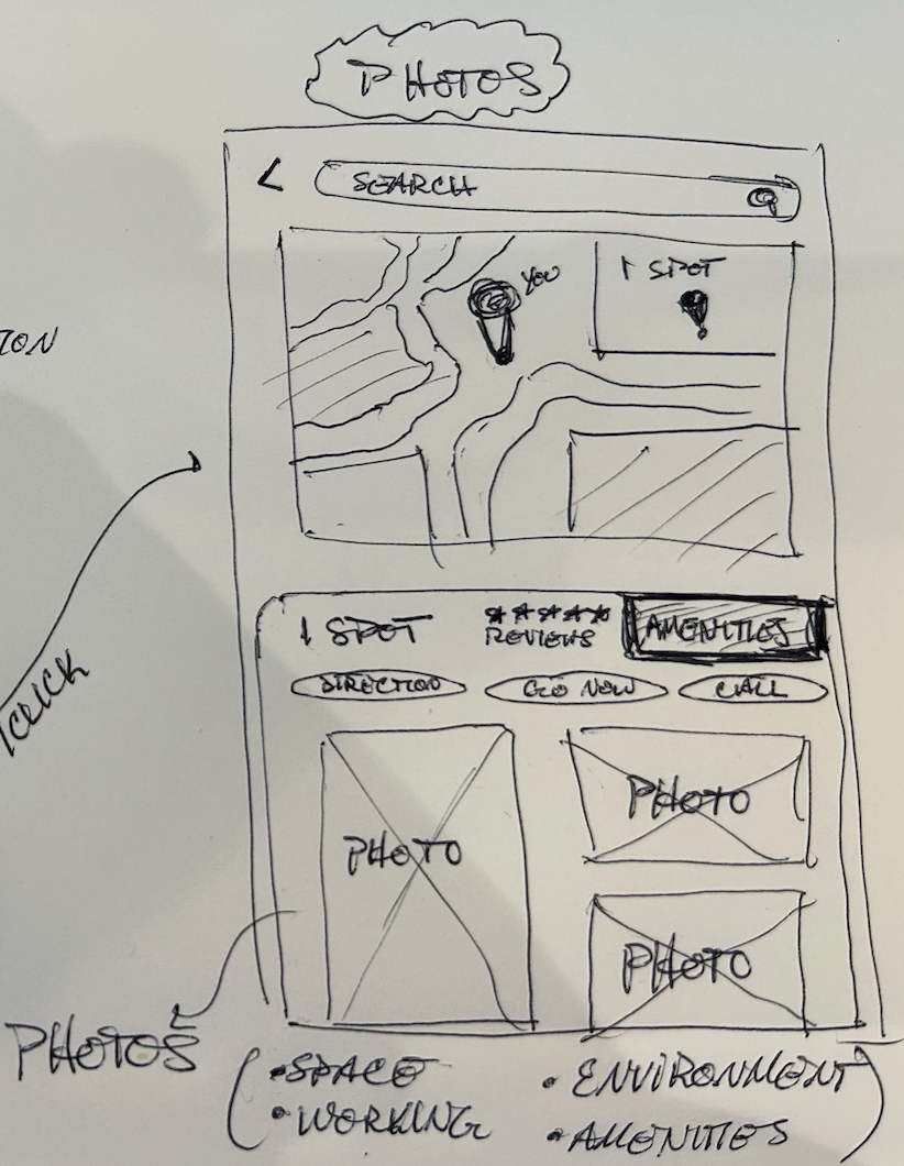
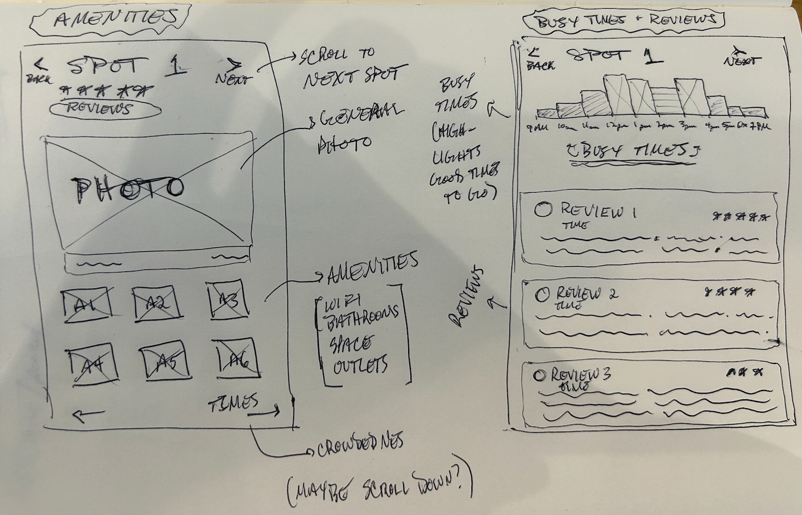
Screen 3 - Amenities
- Scroll through (or swipe UX pattern) so user can navigate and compare options
- Amenities - card views of wifi, bathrooms, space, outlets, tables, menu, etc
- Busy times is the next CTA
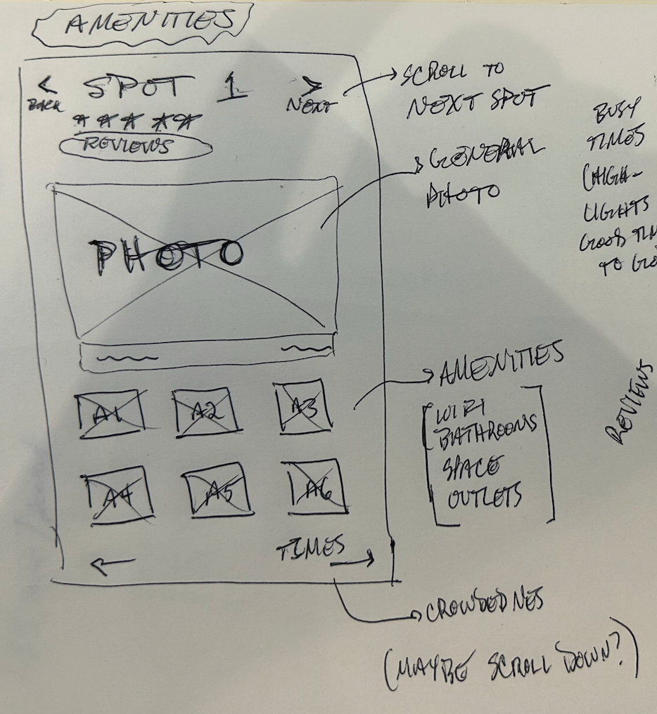
Screen 4 - Busy Times & Reviews
- Busy times - view throughout the working day
- Map on best times to go
- Highlights it
- Reviews below - starting with most helpful reviews
Day 3: Decide
After taking a look at what a sketched the day before, I dissected each element and came up with a storymap:
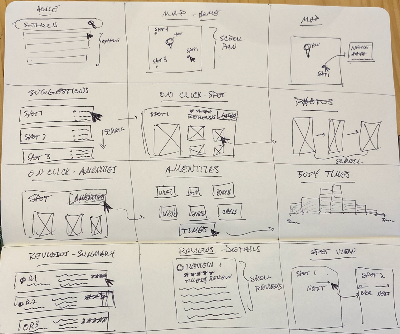
With the following takeaways:
- Map view/location is very important - this should be landing page
- List of suggestions (so user doesn’t need to use search) - provided up front
- Photos are up front and center
- Busy times - suggest to user best times to go
- Amenities - part of summary of each spot
- Reviews - part of summary of each spot
Day 4: Prototype
On day 4, I arrived at the fun part of the sprint - designing the solution. Using Figma, I came up with the following 3 screens (noting that I missed a core design constraint that PostUp wants to charge users a subscription to access their data):
Screen 1 - Landing Page:
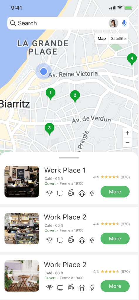
- Proximity
- Overview
- “More” - brings user to sign up page to pay subscription (design core design constraint)
- Snapshot of photos/reviews/amenities
Screen 2 - Sign Up
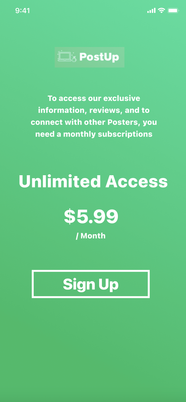
- Core design constraint - this would take the user through a whole signup/checkout flow so that they can create an account to gain access to PostUp’s data and information as well as see other “PostUpers”
Screen 3 - Spot Detailed View
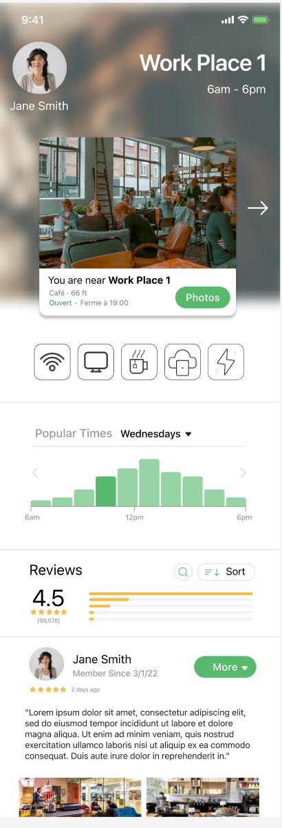
- After signing up, users would gain access to PostUp's data
- Users can access all information needed on a spot to post up so that they can decide if they wish to go work from there
Day 5: Test!
After creating a short (3 screen) prototype for Post-Up, I met with 5 users to test and receive feedback on what I produced. Due to the nature of the design sprint (and coincidentally the lack of time), I didn’t prepare much of a test script beforehand other than a few questions:
- Let’s say you want to find the best places to work in a neighborhood so that you can get what you need done - how might you go about that?
- Can you tell me what you see on these screens (homepage, sign up, spot details)?
- What stands out to you? What are your feelings?
- What’s lacking?
I also did a group interview with 3 participants at a cafe. Both of these methods were slightly “off script” for the typical design sprint (i.e. group interviews and “scriptless” testing). However, I found it useful to see a group’s perspective and also to see how users interact with the prototype without much direction. I then found 2 users to test individually and we went through the script listed about.
Here’s a summary of the useful feedback/quotes:
- Seems pretty straightforward
- Why would I pay for this versus just using google?
- Does it only recommend cafes?
- I am confused, did I pay already once I click sign up or do I have to enter my credit card?
- I think it’s beautifully designed and looks easy to use
- The home screen looks just like google but it’s cool cause it recommends things even before i have to search for them
- I mean honestly it’s really similarly to google
- The detail view is pretty cool cause I can scroll to other one’s easily and compare
- I like the review section, but the text is hard to read
- The amenities icons are cool but they’re not super readable
Final Product:
I tidied up the design/prototype based on the testing sessions and came up with the final solution of the product: