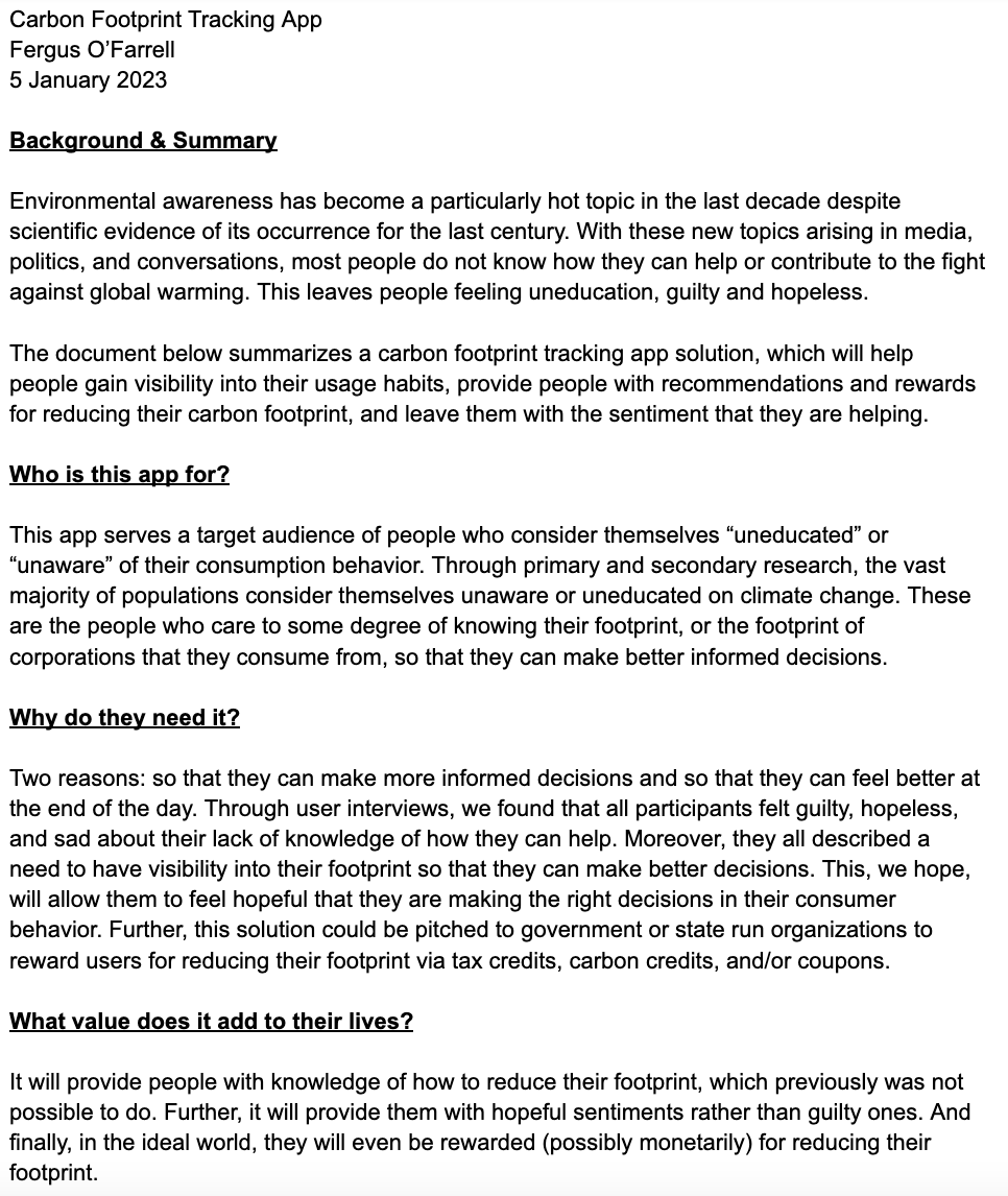
Informing Sustainable Decision-Making
Carbon cure is an app idea I started and launched as a UX research project to help provide consumers with an intuitive way to visualize, educate, and get rewarded for reducing their individualized carbon footprints. I used the standard design process to develop an application with a user-centric approach.
Step 1: Empathize & Research
I started the process with an 8 page secondary research report analyzing consumer behavior in regards to how they think, feel and make purchasing decisions.
The Findings...
- Consumers have no visibility into their impact on the environment
- Data suggests consumers have desire to learn more and help in the fight against climate change
- Education is likely a primary concern
- Fear is a secondary concern
Survey Data
Before conducting user research interviews, I sent out a survey to individuals from a wide range of backgrounds to gauge some initial data points. I received 32 responses. Summary of the findings below:
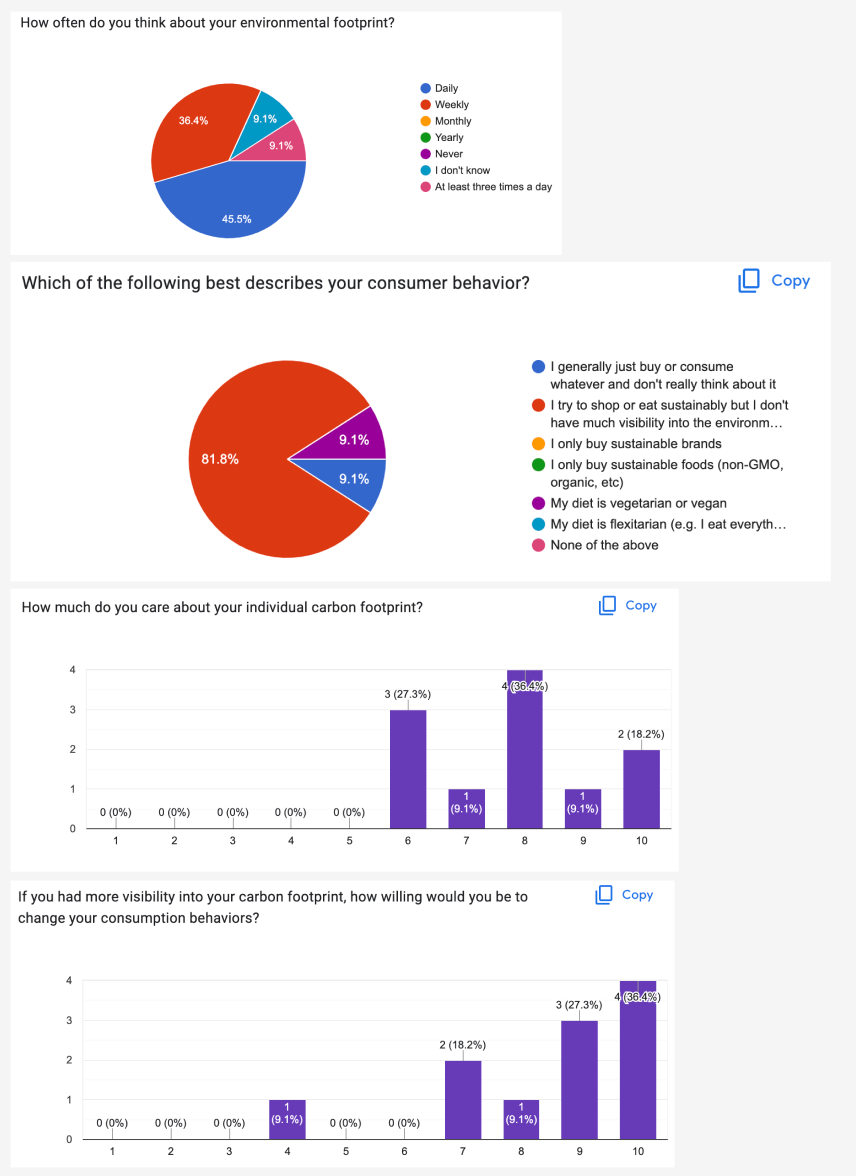
It's clear from the data that most people have little to no visibility into their footprint but would be willing to change their consumption behaviors if they had more visibility. I proceeded with selecting 6 individuals for interviews.
User Research Interviews
- 6 Interviewees
- Varying Ages (22 - 61)
- 50% female, 50% male
- 45 min interviews
Questions:
- Feelings on climate change
- Knowledge of the topic
- Desire to know more
- Would you use solutions if they were provided to you?

Step 2: Define
The next step in the design process was to start defining some themes, user personas, and problem areas.
Themes & Affinity Map
6 themes identified from research interviews:
- Visualization/Measurability
- Education
- Corporations vs. Individuals
- Products
- Feelings
- Behaviors

User Personas & Empathy Maps
I took the data from the interviews and digested it into 2 user types: an educated user and an uneducated user. Below are snippets of the empathy maps and user personas:


Problem Statements & MVP
Based on the research and themes identified, I used the "how might we..." framework to start identifying a minimum viable product.
How might we...
- Provide Visibility
- Provide Measurability
- Provide Hope
- Provide Education

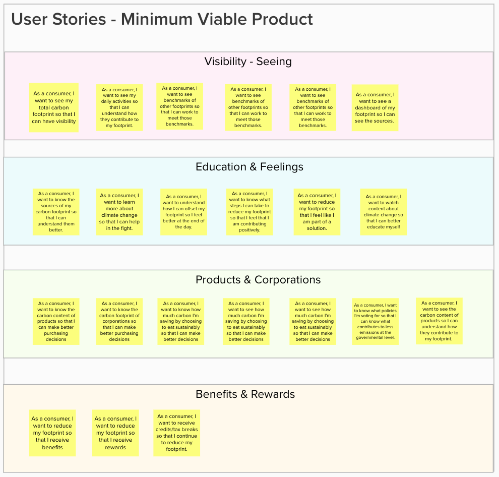
I then wrote a solution document with the following user stories:
Minimum Viable Product document here
User Stories:
Step 3: Ideate
After defining the product, 5 core user flows were identified. I began building a sitemap of where these flows would live in the product information architecture:
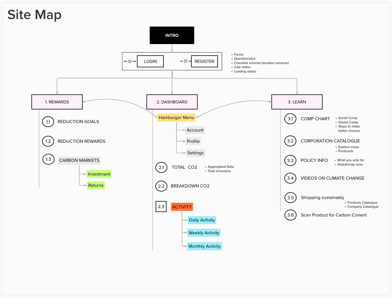
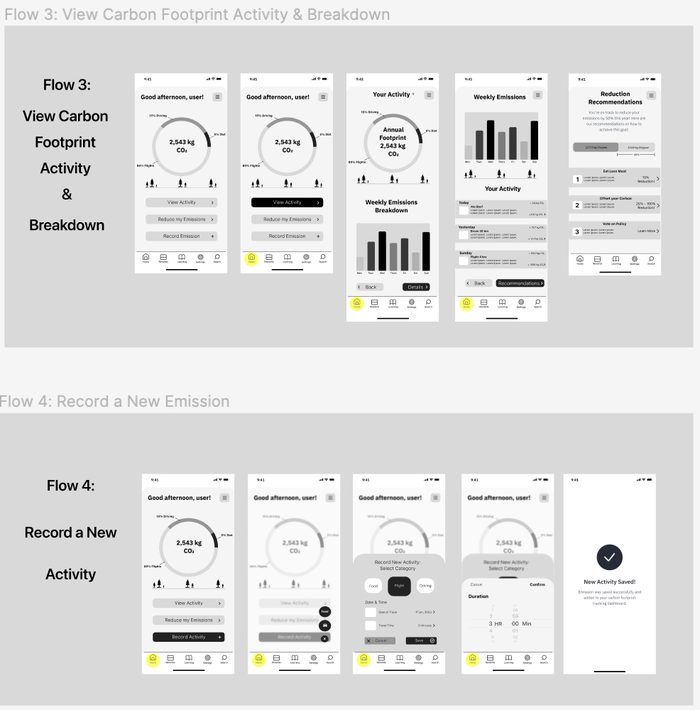
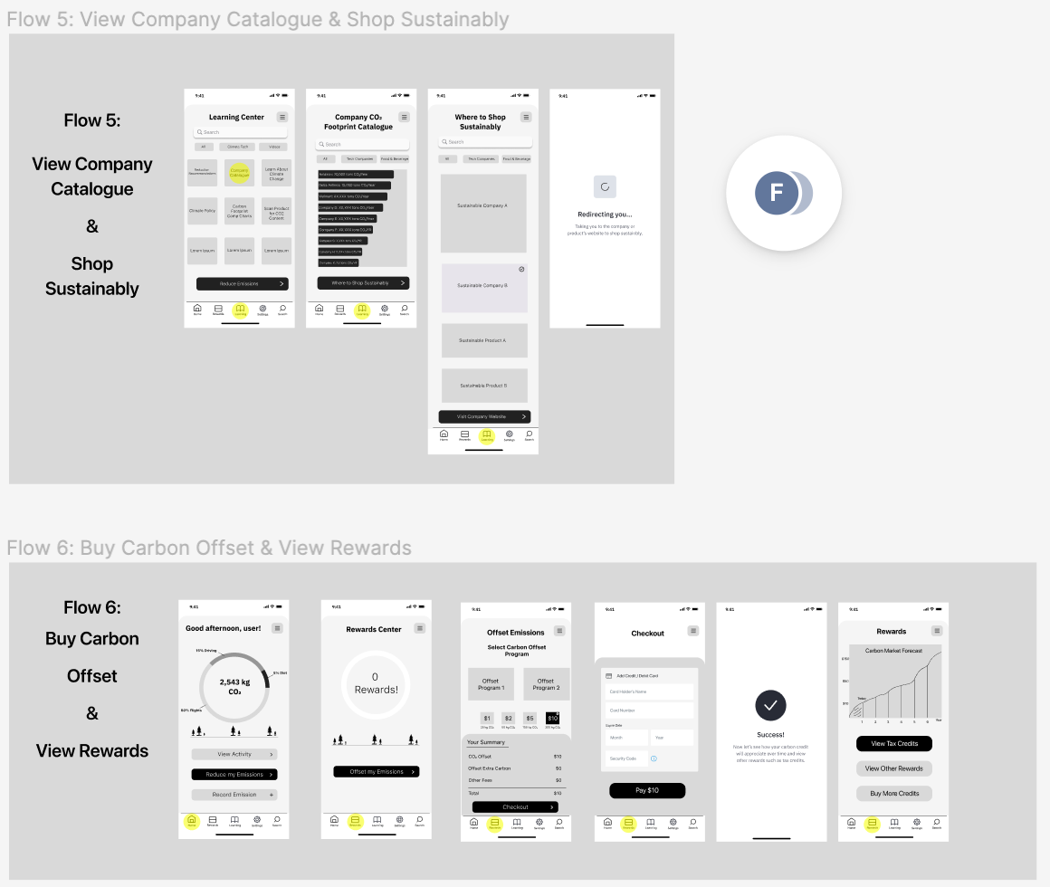
The 5 core user flows:
- Sign up & calculate footprint
- View carbon footprint activity & breakdown
- Record a new activity (emission)
- View recommendations to reduce footprint
- Buy carbon offsets and get rewarded
Step 4 & 5: Design, Prototype, Test & Repeat
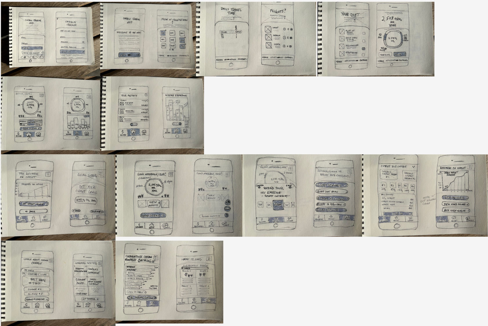
The design and prototype phase was conducted with initial paper sketches & guerrilla testing, low-fidelity wireframes & testing, and finally high-fidelity prototyping & testing. 5 different users were tested from various demographics at each of the following stages before moving on to the next:
Sketches
Low-Fidelity Wireframes
After gaining feedback from 5 users, I used Figma to create low-fidelity wireframes for the core user flows:
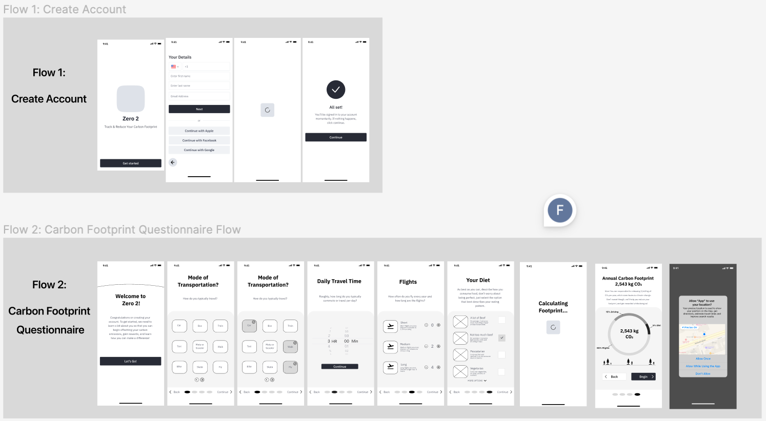
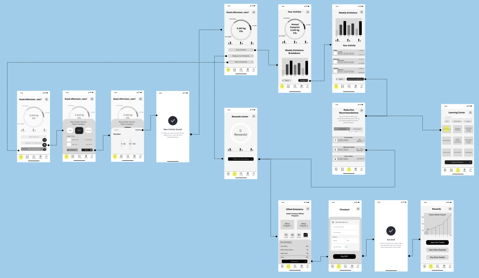
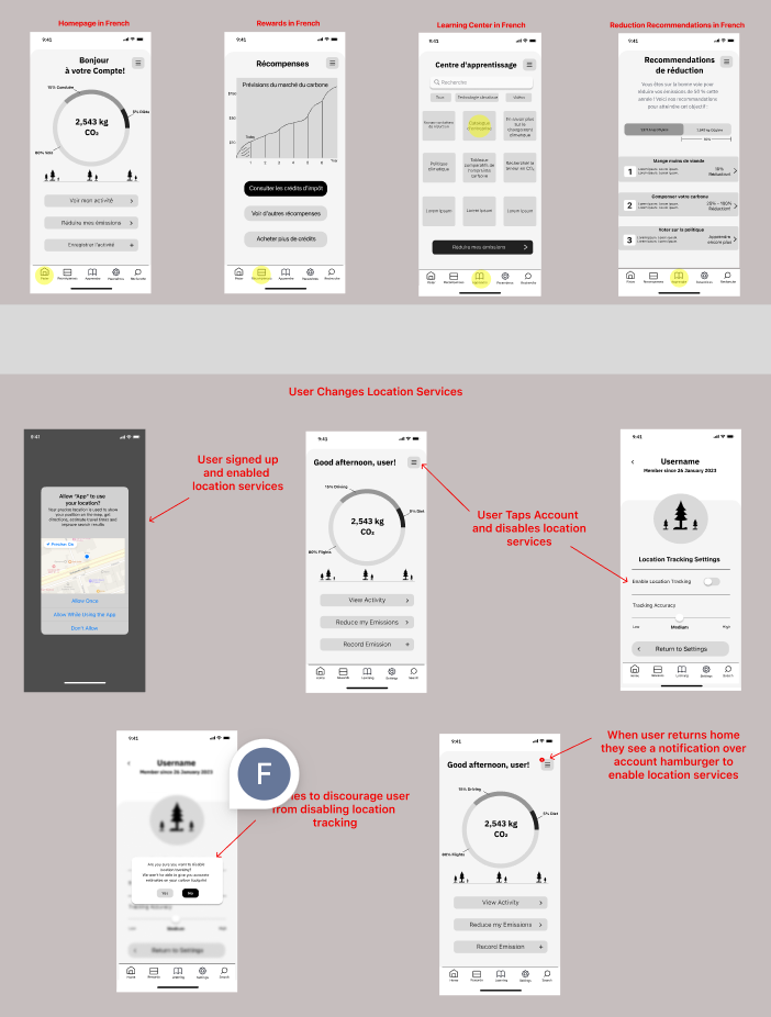
Wireflows & Edge Cases
As a best design practice it's always a good idea to idea to plan ahead for some edge cases and to make sure your flows are succinct. I built these into my application before moving on to any high-fidelity prototyping:
Styling
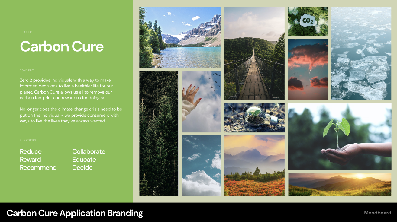
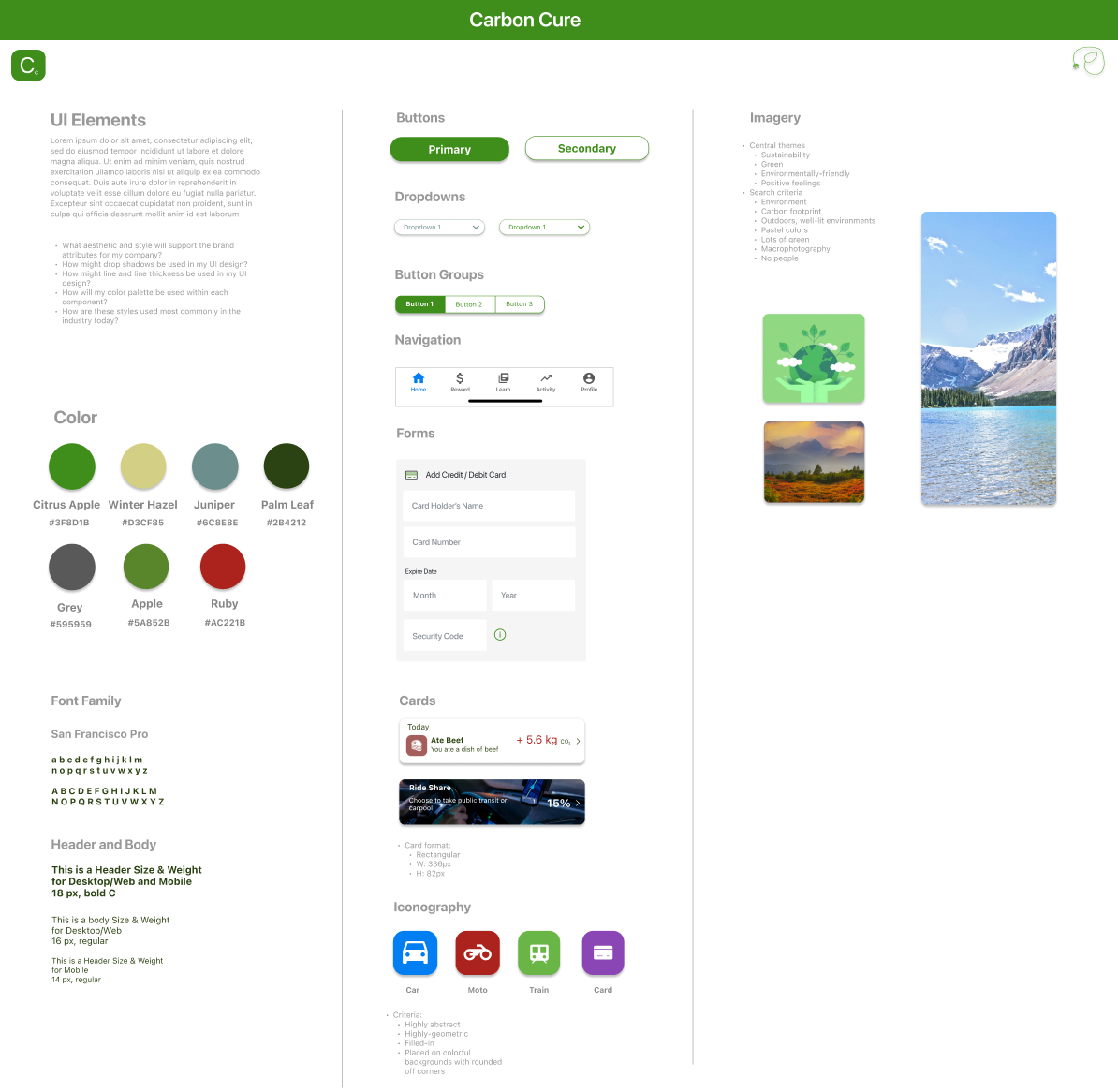
Using the themes identified during the research phase, I decided to choose a color palette, fonts, and photos that evoke happy, friendly and "non-scary" feelings so that users feel safe, positive, and excited to improve their carbon footprints:
High-Fidelity Prototyping
After another 5 rounds of user testing in low-fidelity, I designed and built high-fidelity prototypes for the core user flows. Once again, I tested these with 5 different users and built the final results below: